Simple Amortization Chart
₹0.00
Download a Spreadsheet for Creating a Simple Amortization Chart in Excel
- Description
- Reviews (0)
- More Products
Description
Description
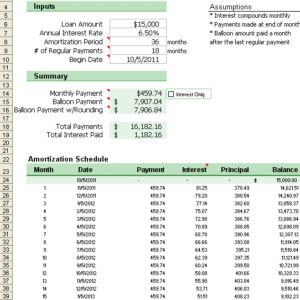
An amortization chart is created from an amortization table or amortization schedule to show visually how the balance, cumulative interest, and principal change over time. Amortization charts are also very useful for comparing two different loans. The purpose of this page is to highlight two tricks for creating these charts, and provide you with a free simple amortization chart template.
Use this basic amortization spreadsheet to see how to create an amortization and payment chart in Excel.
Creating an Amortization Chart
One of the tricks to creating a chart like this in Excel is knowing what type of chart to use, and how to make it work for a variable length amortization table. I’m not going into detail, but I’ll give you the 2 tips that you’ll need. If you want to see how they work, take a look at the above spreadsheet.
- Use an X-Y (Scatter) Chart. This doesn’t let you create bar graphs (without some fancy error bar tricks), but bar graphs waste a lot of ink so I try to avoid them anyway.
- For the X-axis, use the NA() function to avoid displaying the portion of the range after the last payment. You’ll see how this works if you take a look at the Period column in the template.
There is another trick which I use in a lot of my mortgage calculators. However, it is more complicated, and designed to make it hard to figure out what is going on. It involves creating dynamic named ranges and using the named ranges for the series in the chart. This technique is not as compatible with other spreadsheet software, though.
Reviews (0)
Be the first to review “Simple Amortization Chart”
More Products
-
 Select options This product has multiple variants. The options may be chosen on the product pageQuick ViewProgramming & Tech
I Will Fix Your Website and Domain DNS Errors Swiftly and Efficiently
₹3,500.00 – ₹12,450.00





Reviews
There are no reviews yet.